In our previous section, we learned about how we can create multipage UI in PhoneGap. Now, we will learn about Collapsible Content Block and how we will use it in our PhoneGap app.
Previously, we were dealing with limited real-estate in mobile app development, and we don't have enough screens to take it up. For this, there are different techniques used in the UI in order to avail yourself of as much extra real-estate as possible on the screen. In this case, we will deliver "Collapsible Content Blocks" to it. These blocks are simply blocks that can collapse to give us more room on the screen.
We will use our previous example for the Collapsible Content Blocks. These are the following steps used to include Collapsible Content Blocks in our app:
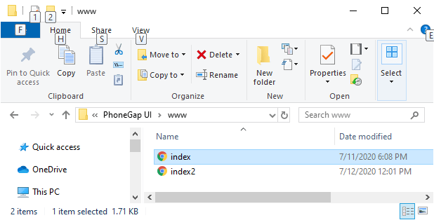
1) Create index2.html file
We will create a new file index2.html with the same code as preset in the index.html. We will make changes later in index2.html file not in index.html.
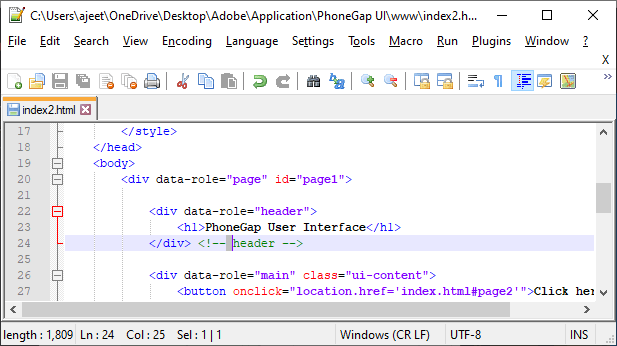
2) Create collapsible blocks
Now, we will create a div tag for a collapsible set that will contain several tags for creating different blocks. We will create a block with some content that will execute when the data-collapsed is set to false.
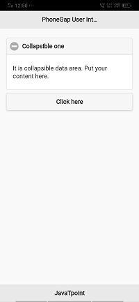
3) Create another collapsible block
Next, we will create two another collapsible block. First collapsible will be set for the default and second for true. We will copy the first collapsible block and use for both in the following way:

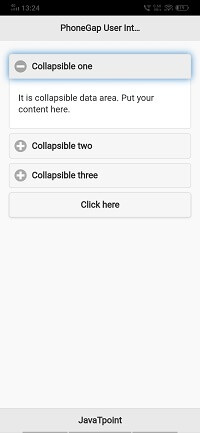
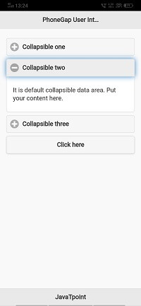
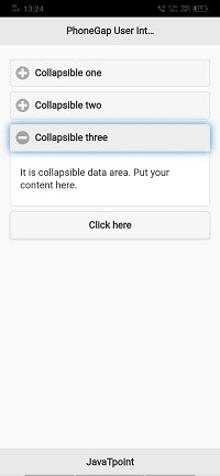
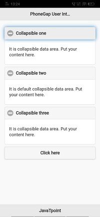
Note: Only one collapsible will be open at a time.
It is really a nice way to deal with a lot of data on our screen in JQuery mobile. We have a very limited screen area, and the Collapsible Content Block will help us the use that area to its fullest.
No comments:
Post a Comment